We have done
Whitespace revitalized new brand identity for Bright c-store (convenience store) which strategically located at every Pertamina gas station in Indonesia and was created to unify the formerly different brand names into a single brand name.
Bright is one of the business lines of non fuel retail of Pertamina Group the biggest oil & gas company in Indonesia. The brand Bright is also added value for the gas station, which creates new income. And it was built not only for a convenience store, but the name itself is designed to be extended.
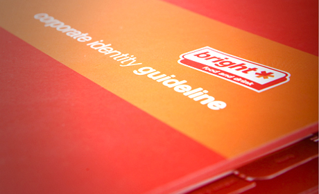
The brand logo uses in-and-out arrow, which represent a store that stocks up a range of everyday items, always ready to serve the customers by giving 24/7 quality service. The color red and orange represent spirit and dynamic energy. The corporate identity guideline was built to create the same look and feel for all their marketing materials and sign system, which helps solidify their brand in the market.